First I'll show you my before and after photos of the sketch vs. how it actually turned out: (keep in mind they are zoomed out so that you can see how the content is included. In reality you would need to scroll and it would be a lot bigger!
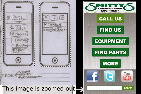


So now, I will now explain further in the process on how I achieved what is displayed above. Starting with mobile.
I used dreamweaver and put the display mode on mobile in order to see how it would fit on a mobile device. Then I added the basic divs and content, along with css rules. From there, my tablet and desktop sketches only contained the search bar and media icons in similarity. This is where css comes in handy, and a little html changing.

Here is part of the css I used for the mobile portion. Everything is the same on how you would make it, meaning you have a style sheet and then rules. So for instance I created a content section #content, and the rules and everything under the classes,tags, and such are applying to everything...(tablet,mobile,desktop),however I specifically set the rules to apply to a mobile site. Then when designing the tablet portion, you take the specific information your changing and add rules that apply to the tablet. So I created another div called content4 and put that as display:none;, so you couldn't see it on the mobile site. Then when I put in media queries, I applied a new rule in order to show it, which was -----display:block!important;

As you can see from the example I have of a @media (min-width:960px). So all the rules under this section of the style sheet will apply for desktop. I didn't need to copy everything, but it gives you a better example on how they are the same css, with few changes. Also I had to pasted most all of the coding from mobile since I changed them to display:none in order for them not to show.
This is really confusing at first! I had to play around with this a lot. I mean A LOT! I didn't understand how this was working and how I could change my mobile to hide everything or add things. I created the mobile first as your suppose to, but then created a tablet on a different site. You do not need to do this because things like body, headings, and all that are the same throughout. Classes you apply to divs and such are what need to change. For instance on desktop I kept everything from tablet, but added another section for the about part of the page. This is just making it hidden on mobile and tablet, and displaying it on the css sheet coding.

It hit me after I started watching my coding every now and then in "preview safari". Also just changing it on the actual dreamweaver part. This image you see is your new best friend!
Want to see this actual site of me redesigning Smitty's Lawn and Garden (pretend) (links are just #)!
CLICK HERE-
Warning it looks better in safari. and for some reason not good at all on firefox, (the portfolio page)
CLICK HERE-
Warning it looks better in safari. and for some reason not good at all on firefox, (the portfolio page)


