Portfolio

Showing posts with label tablet. Show all posts

Tuesday, May 19, 2015

Mobile-First Design

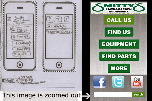
The project was to redesign Smitty's Lawn And Garden Website, using media queries and mobile first rules. This process is different from responsive site building because you start backwards. Step one was to figure out what was important and fill out a packet pretending you are with the client. Afterwards, I designed the sketches, starting with mobile, all the way to desktop on paper.

First I'll show you my before and after photos of the sketch vs. how it actually turned out: (keep in mind they are zoomed out so that you can see how the content is included. In reality you would need to scroll and it would be a lot bigger!


OKAY!
So now, I will now explain further in the process on how I achieved what is displayed above. Starting with mobile.

I used dreamweaver and put the display mode on mobile in order to see how it would fit on a mobile device. Then I added the basic divs and content, along with css rules. From there, my tablet and desktop sketches only contained the search bar and media icons in similarity. This is where css comes in handy, and a little html changing.

Here is part of the css I used for the mobile portion. Everything is the same on how you would make it, meaning you have a style sheet and then rules. So for instance I created a content section #content, and the rules and everything under the classes,tags, and such are applying to everything...(tablet,mobile,desktop),however  I specifically set the rules to apply to a mobile site. Then when designing the tablet portion, you take the specific information your changing and add rules that apply to the tablet. So I created another div called content4 and put that as display:none;, so you couldn't see it on the mobile site. Then when I put in media queries, I applied a new rule in order to show it, which was -----display:block!important;


As you can see from the example I have of a @media (min-width:960px). So all the rules under this section of the style sheet will apply for desktop. I didn't need to copy everything, but it gives you a better example on how they are the same css, with few changes. Also I had to pasted most all of the coding from mobile since I changed them to display:none in order for them not to show.


This is really confusing at first! I had to play around with this a lot. I mean A LOT! I didn't understand how this was working and how I could change my mobile to hide everything or add things. I created the mobile first as your suppose to, but then created a tablet on a different site. You do not need to do this because things like body, headings, and all that are the same throughout. Classes you apply to divs and such are what need to change. For instance on desktop I kept everything from tablet, but added another section for the about part of the page. This is just making it hidden on mobile and tablet, and displaying it on the css sheet coding. 


It hit me after I started watching my coding every now and then in "preview safari". Also just changing it on the actual dreamweaver part. This image you see is your new best friend!


Want to see this actual site of me redesigning Smitty's Lawn and Garden (pretend) (links are just #)!
CLICK HERE-


Warning it looks better in safari. and for some reason not good at all on firefox,  (the portfolio page)

Tuesday, March 24, 2015

The need for mobile sites.

  Think about how many websites you visit a day...Theres probably more than you think. Food,maps,shopping, school work, pictures, Facebook, any social media. With millions of websites out there, why would you not? The information is at your fingertips! But, how many of those sites did you use the internet on a phone or mobile device.

Each year the percentage of mobile users compared to desktop users are increasing significantly. With 4G internet, easy access, and many needs, people are constantly researching and looking online. However, with the sites so convenient and recognizable, people go directly to the page they need and exit. There is no need to log onto a computer and sit down for something that you only need for a couple seconds to minutes. We always have our phones with us, so why not?

Don't believe it's true?

Well, taking my school site "onwravens.net" statistics, you can see the change. In 2013 to 2015, the number of desktop users dropped around 23%, and mobile usage doubled to 35%, not to mention tablet usage also increased 3%. Now this is a school site, so of course people are not checking this everyday, like they would maybe Facebook. For this site the bounce rate, which is visiting a website for one page and then exiting, was high. More than fifty percent of people visited one page on a mobile device before leaving in 2012, and this continued, and increased, in 2015. Compared to desktop with people viewing more sites and less of a bounce rate, it shows that people use there phones a lot more for quick, one page looks, before leaving to do something else. I predict by next year the numbers will keep going up, and the only need for desktop is for more "efficient and longer" task, but to just to check the weekly announcements, stick to your phone.

Is this true for other sites?

Smart in sights
First take a look at how the global usage of data compares. Now looking at this chart from Smartinsites, shows us that mobile users has surpassed desktop, and continues to grow. It was predicted in 2010, that this would happen, and they were right! Think about why this would happen? Technology has grown significantly and is constantly improving. It's like when the new iphone comes out. As soon as you get that new phone, a new one is going to come out next month that all your friends have or you see advertised. People adapt with the technology. 
Clickz
Now for specific sites, here is Amazon.com. There was more desktop usage in 2014. However, with amazon, people are using credit cards and shopping, so maybe they want to be more careful...OR maybe they haven't seen the more "convenient" way.

clickz
If you don't know, amazon has an app! During June of 2014, hardly anybody was using the app, but by November the chart sky rockets. The app is advertised, people are informed, its easy, it's quick, it's on the edge of your fingertips on click a way. And thus, the mobile percentage of users increases. This really makes you think about if your building a website. It should be responsive and work on a mobile device!