Portfolio

Showing posts with label design. Show all posts

Monday, August 17, 2015

Finding the Right Site For the Right Photo

        To find the right photo that has no copyright and that is completely free can be hard. However, with sites like Morguefile.com, Pexels.com, gratisography.com, and unspash.com makes it a lot easier. Which site offers the best though? I did a trial on these four by picking a topic, and searching for the "perfect" photo on each site. Heres my results:

TOPIC: Balloons


 SITE 1: Morguefile.com 
        Morguefile.com is very easy to filter, to navigate and to save photos. I got 841 results total for searching balloons, ranging from gorillas holding balloons, art, hot- air balloons, to just regular helium balloons!!! It was by far the fastest site out of the four and gave me more choices. It has the easiest search and navigation system also. The navigation goes further to filter by allowing you to choose the options of: popular, recent, last downloaded, and most downloads. For me, popular and most downloads are the best options. 'Most downloads' category filters the best because it's more specific and doesn't stray with the more random photos that just involve your subject matter. The only con I have for this site is sometimes the photos are not the best quality and some things are harder to search for. This topic was pretty easy, but for something harder that's very specific, such as "tear" or "rain", you can get very odd results. As far as downloading them,  I would give it the best rating because by clicking the picture you have another option to download it, instead of it just popping up and downloading or appearing on a different screen.

Site 2: Pexels.com 


      When I searched for my topic, I only got six results...so that is the big con on this site for this specific search. It was very easy to search and navigate though. I got more of landscape/subject matter instead of a particular balloon, and in great quality. It's easy to download also, the second best out all four sites. It redirects the page to the photo enlarged and then I can choose to download or go back. I don't like the fact that my whole page is redirected, but it's quick and efficient. For other topics there are a lot more results. Plus, they are all very good quality and look professional. 


Site 3: gratisography.com

     This site had a lot of photos to choose from, but unfortunately I was not able to find anything with "balloons". Maybe if I spent all day scrolling through the endless photos, something may have popped up, but who has that time? To narrow it down you can choose six alternative categories. My topic was fairly difficult for this site, but I went with objects. These photos are odd, beautiful, and interesting. They have amazing quality too. In basic terms, I think they have the best photos.     However, balloons still did not appear. The negative of this site would be the search bar. Besides that, the downloading is easy. All you have to do is click it! For a lot of people this is probably something they would like, especially being short of time. However, for me I like to click it and see how big the actual photo is and then choose to download. That is not always though, and on certain times I think this would be the best site for quick downloading!


Site 4: unsplash.com

    Unsplash had some of my favorite pictures, just not for my subject. I got 6 results, with one being a lady holding regular balloons. The plus it that they have a search bar, and you can filter by subject and/or featured photos. The downloading is awesome too! Click a photo, and it appears in a new tab, fully downloaded in a second, which is far better than gratisography. Most of the photos have a different feel to them. They seem vintage, yet modern, and seem to have a lot of different filters. The only bad thing about this site I could say is that if your searching for photos you have to look up items and specifics. I can not type in "hugging", or "scared", which leads me to this not being my all time favorite..


In Summary: WHO WON?


  1. Morguefile.com- This is my winner, probably because I use it so much. I like being able to look up simple words and not subjects. I can look up portraits,emotions, landscapes much easier. I also like the second choice of wanting to download without it taking over my page and having to go back. This is my winner with just taking web design and blogging in my mind. As far as amazing quality, this is not the winner.
  2. Gratisography.com- The runner up! Yes, I know....why choose it without a search bar? Well I like the unique, random photos. They're playful,funny, and some are just creepy. I might not use this to get photos for a particular research project, but it gives me inspiration for ideas and drawings.
  3. Unsplash.com- I love the vintage feel of this site, plus it has a search bar.  The pictures are absolutely amazing, especially landscapes. This site feels more real, and has good inspirational pictures also. Is it better than the others? Well, it all depends on my need and what the photo is I am searching for.
  4. Pexels.com- This site seems like a combination of the sites, but with good quality, modern photos. It's very broad, open, and inviting. These photos have a really good focus on them, and make the subject come to life. It's easier for category searches to...like "summer".

Picking a site, depends on what kind of photos your looking for and the level of professional look to fun. I like all of the sites for their photos, now it's up to you looking at the pros and cons of each one to decide which is right for you!

Tuesday, May 19, 2015

Mobile-First Design

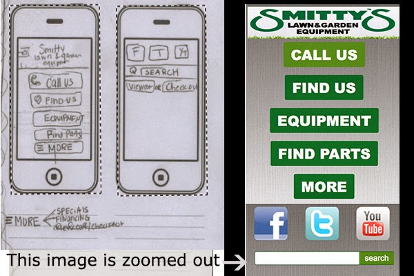
The project was to redesign Smitty's Lawn And Garden Website, using media queries and mobile first rules. This process is different from responsive site building because you start backwards. Step one was to figure out what was important and fill out a packet pretending you are with the client. Afterwards, I designed the sketches, starting with mobile, all the way to desktop on paper.

First I'll show you my before and after photos of the sketch vs. how it actually turned out: (keep in mind they are zoomed out so that you can see how the content is included. In reality you would need to scroll and it would be a lot bigger!


OKAY!
So now, I will now explain further in the process on how I achieved what is displayed above. Starting with mobile.

I used dreamweaver and put the display mode on mobile in order to see how it would fit on a mobile device. Then I added the basic divs and content, along with css rules. From there, my tablet and desktop sketches only contained the search bar and media icons in similarity. This is where css comes in handy, and a little html changing.

Here is part of the css I used for the mobile portion. Everything is the same on how you would make it, meaning you have a style sheet and then rules. So for instance I created a content section #content, and the rules and everything under the classes,tags, and such are applying to everything...(tablet,mobile,desktop),however  I specifically set the rules to apply to a mobile site. Then when designing the tablet portion, you take the specific information your changing and add rules that apply to the tablet. So I created another div called content4 and put that as display:none;, so you couldn't see it on the mobile site. Then when I put in media queries, I applied a new rule in order to show it, which was -----display:block!important;


As you can see from the example I have of a @media (min-width:960px). So all the rules under this section of the style sheet will apply for desktop. I didn't need to copy everything, but it gives you a better example on how they are the same css, with few changes. Also I had to pasted most all of the coding from mobile since I changed them to display:none in order for them not to show.


This is really confusing at first! I had to play around with this a lot. I mean A LOT! I didn't understand how this was working and how I could change my mobile to hide everything or add things. I created the mobile first as your suppose to, but then created a tablet on a different site. You do not need to do this because things like body, headings, and all that are the same throughout. Classes you apply to divs and such are what need to change. For instance on desktop I kept everything from tablet, but added another section for the about part of the page. This is just making it hidden on mobile and tablet, and displaying it on the css sheet coding. 


It hit me after I started watching my coding every now and then in "preview safari". Also just changing it on the actual dreamweaver part. This image you see is your new best friend!


Want to see this actual site of me redesigning Smitty's Lawn and Garden (pretend) (links are just #)!
CLICK HERE-


Warning it looks better in safari. and for some reason not good at all on firefox,  (the portfolio page)

Thursday, April 23, 2015

Creating A site using Weebly

I experimented this week with a site called Weebly. It was very simple and easy to use. It takes you through the process and has the layout right there for you, including different page layouts. Plus, it's a big time saver, since you only need to really edit the  content. Let me show you how it works.

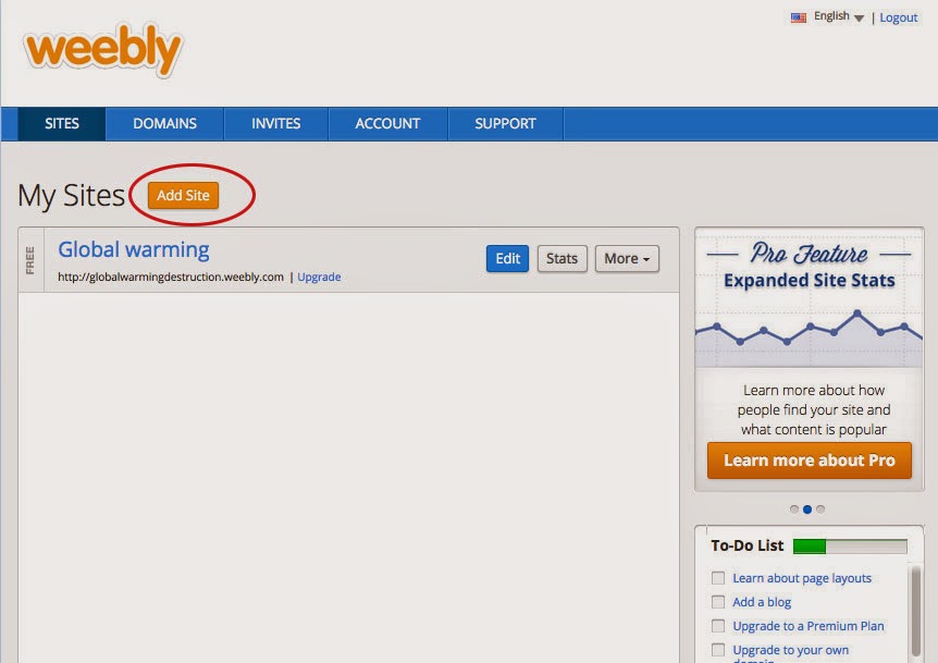
  1. First make your Free Weebly account. This allows you to publish an actual website with ".weebly.com", if you want your own domain, you must purchase it. It explains this in the site. Start off by hitting create new website.  As you can see, I already have a free website "Global Warming". This was for Earth day of 2015. This site does not have its own domain, but you can see it by going to "globalwarmingdestruction.weebly.com/". It goes over some of the causes and future we have with global warming occurring.                     
  2. Next it will ask you if you want a site, blog, or store. I chose Website. Then choose a theme. I chose to narrow down my search to websites that had a simple layout and a color scheme green and dark. The one I chose is circled in the picture.


       3. Next it will ask you if you want to have a domain or subdomain. Mine is free, meaning the weebly version. By picking something other then the top choice, you will have to purchase it.
        4.  From here it takes you to the layout where you can edit the content, pages, colors... It's very simple to use. You can edit anywhere there is text (except the footer), and when adding pages, it keeps the basic structure and you pick the layout to fit that specific page.

    5. For example, by hitting pages at the top, I can add a contact page. I will call it Contact, and then choose what I want the layout of that to look like. They have layouts ranging from About us to contact,  and even a MENU, if you had one.
I personally loved making a website, because it was fast, clean, and efficient for what type of website I was needing. It also would make a really good website if you wanted to start up a company, and needed something you could manage yourself, since time management goes quickly in this site builder. Also it's great for basic pages. And say you don't see the layout your looking for? You can delete parts, and rearrange! Simply hover over what you would like to edit, and it will pop up options for that specific element. I could delete it, enlarge it, shrink it...etc. Another thing is, it's great for having the basics. If I needed an about page, contact, and menu, the layouts are already there, and I wouldn't have to make my own css and html.  Plus I can highlight the text and change the color and size with a click of the button.


I could also just use the side bar and drag in what I want to a page! The only negative side is that maybe you want a theme that isn't provided and pages. But I wouldn't say that's to big of a downer for a simple start out site. Its faster then dreamweaver, and lets you add photos that aren't even saved for web! I recommend this site for anyone. Unless of course, your to advance. However, even then, you can add your own code and make it even better, faster! With the embed code section. And you have to tools with one click. I think it's pretty good for usability and people could have a lot of fun experimenting with this site. It's good for stores,blogs,sites,restaurants, and more. Once again, to see an example of a site I made using this, go to "globalwarmingdestruction.weebly.com/"


Tuesday, March 31, 2015

Redesigning a High School Website

For this project, I looked up school websites, and then using the same color-scheme and content, recreated the home page based on a company site. Below is the original school website, the company I am basing it on, and then my creation of the website. Then I go into the minor things I did.
Original School Website
Company website
My Website

Okay, So now I will show you different aspects of my website. I will show you the hover colors, the logo difference and responsiveness of my site. However, I did not add a translate button, as the school  did.
My Site is responsive, but the school's was not.


The hover color is red, with a background of blue, to keep the color scheme of the website.

I kept the blue color in the eyes. But I didn't know what their logo was until I saw the address of "RedHawk"

In Summary: I would like to show you a side by side of my website and theirs, and let you know I kept the color scheme, and content (except for the translate), changed logos, and also made it responsive.


To see the model of the new website's home-page (only the home page!!), click HERE

Monday, November 24, 2014

Texture in Web Design


The following  answers summarize a tutorial on Smashing Magazine’s web site, called The Whys And The Hows Of Textures In Web Design, by Jon Savage and Simon Hartman. 


  • Texture is seen a lot being misused, making a website look not as attractive... Instead the website looks "dirty" or "grungy". In reality the texture was just over used and misused! 
  •  Textures are bigger and don't repeat, whereas patterns are repetitive small images, and can be tillable...
  • Texture can direct the attention of users to certain elements, directing them as a "call to action". It also can separate your context from the rest of the website, highlighting certain things like the title, backgrounds of menu's...
  • It can guide the  eye and create divisions in your work. While also creating a good contrast and layout that allows users to process the information, completing the website's style.
  • Texture can give a website the "wow" factor, making it memorable and more appealing. It gives your website more of a style and brand,  by adding an emphasis.

Tips
  1. Maintain Legibility: Make sure your texture is not to dramatic, in which your text in unreadable, or had to make out.

  2. Dont Beat a Dead Horse: Don't use texture in bulk because it will be distracting and less appealing.

  3. Practice Means Improvement: Play around with different textures to see what you like best.

  4. If It Serves No Purpose, Take it Out: Make sure your texture is there for a reason, that is benefiting your website, not there because "I couldn't decide", or " i through it in there".. Have a reason to different texture elements.

  5. Consider the Effect You Are Trying to Achieve: Picture the end in mine, with the mood your trying to create. Keep the texture to just create the effect, not over-due and kill the mood.
  6. Collect Resources so you Dont Have to Search Later: Create a folder with all of your resources like free brushes and styles so you will always have them for backup and future use.

  7. Learn Masks: When designing, keep in mind that hiding different layers is benifitial  and time saving.

  8. Dont Sacrifice Quality for Loading Time:  Do not use a poor texture in order for quicker loading time.  Try repeating small tiles of textured patterns.

  9. Choose Textures Logically : Pick your texture based on your website's point and goal, make it relevant that they match.  (you wouldn't put random bubbles background on youtube...)


What are 3 different ways you can come up with your own original texture images? 


  1. Take pictures yourself to upload. (bark, wood, dirt...texture is everywhere..)
  2. Use a scanner to scan materials you have..(Paper bags, mouse pads, wrinkled paper.)
  3. Use tools on the internet! Photoshop has filter effects even in the program. Take a simple layer and merge with multiple. You can take a solid color and add a filter effected to create texture.

GOOD EXAMPLES!
Uinta Brewing

Uinta Brewing

Leaders

Leaders

Jarritos

Jarritos