Portfolio

Monday, August 17, 2015

Finding the Right Site For the Right Photo

        To find the right photo that has no copyright and that is completely free can be hard. However, with sites like Morguefile.com, Pexels.com, gratisography.com, and unspash.com makes it a lot easier. Which site offers the best though? I did a trial on these four by picking a topic, and searching for the "perfect" photo on each site. Heres my results:

TOPIC: Balloons


 SITE 1: Morguefile.com 
        Morguefile.com is very easy to filter, to navigate and to save photos. I got 841 results total for searching balloons, ranging from gorillas holding balloons, art, hot- air balloons, to just regular helium balloons!!! It was by far the fastest site out of the four and gave me more choices. It has the easiest search and navigation system also. The navigation goes further to filter by allowing you to choose the options of: popular, recent, last downloaded, and most downloads. For me, popular and most downloads are the best options. 'Most downloads' category filters the best because it's more specific and doesn't stray with the more random photos that just involve your subject matter. The only con I have for this site is sometimes the photos are not the best quality and some things are harder to search for. This topic was pretty easy, but for something harder that's very specific, such as "tear" or "rain", you can get very odd results. As far as downloading them,  I would give it the best rating because by clicking the picture you have another option to download it, instead of it just popping up and downloading or appearing on a different screen.

Site 2: Pexels.com 


      When I searched for my topic, I only got six results...so that is the big con on this site for this specific search. It was very easy to search and navigate though. I got more of landscape/subject matter instead of a particular balloon, and in great quality. It's easy to download also, the second best out all four sites. It redirects the page to the photo enlarged and then I can choose to download or go back. I don't like the fact that my whole page is redirected, but it's quick and efficient. For other topics there are a lot more results. Plus, they are all very good quality and look professional. 


Site 3: gratisography.com

     This site had a lot of photos to choose from, but unfortunately I was not able to find anything with "balloons". Maybe if I spent all day scrolling through the endless photos, something may have popped up, but who has that time? To narrow it down you can choose six alternative categories. My topic was fairly difficult for this site, but I went with objects. These photos are odd, beautiful, and interesting. They have amazing quality too. In basic terms, I think they have the best photos.     However, balloons still did not appear. The negative of this site would be the search bar. Besides that, the downloading is easy. All you have to do is click it! For a lot of people this is probably something they would like, especially being short of time. However, for me I like to click it and see how big the actual photo is and then choose to download. That is not always though, and on certain times I think this would be the best site for quick downloading!


Site 4: unsplash.com

    Unsplash had some of my favorite pictures, just not for my subject. I got 6 results, with one being a lady holding regular balloons. The plus it that they have a search bar, and you can filter by subject and/or featured photos. The downloading is awesome too! Click a photo, and it appears in a new tab, fully downloaded in a second, which is far better than gratisography. Most of the photos have a different feel to them. They seem vintage, yet modern, and seem to have a lot of different filters. The only bad thing about this site I could say is that if your searching for photos you have to look up items and specifics. I can not type in "hugging", or "scared", which leads me to this not being my all time favorite..


In Summary: WHO WON?


  1. Morguefile.com- This is my winner, probably because I use it so much. I like being able to look up simple words and not subjects. I can look up portraits,emotions, landscapes much easier. I also like the second choice of wanting to download without it taking over my page and having to go back. This is my winner with just taking web design and blogging in my mind. As far as amazing quality, this is not the winner.
  2. Gratisography.com- The runner up! Yes, I know....why choose it without a search bar? Well I like the unique, random photos. They're playful,funny, and some are just creepy. I might not use this to get photos for a particular research project, but it gives me inspiration for ideas and drawings.
  3. Unsplash.com- I love the vintage feel of this site, plus it has a search bar.  The pictures are absolutely amazing, especially landscapes. This site feels more real, and has good inspirational pictures also. Is it better than the others? Well, it all depends on my need and what the photo is I am searching for.
  4. Pexels.com- This site seems like a combination of the sites, but with good quality, modern photos. It's very broad, open, and inviting. These photos have a really good focus on them, and make the subject come to life. It's easier for category searches to...like "summer".

Picking a site, depends on what kind of photos your looking for and the level of professional look to fun. I like all of the sites for their photos, now it's up to you looking at the pros and cons of each one to decide which is right for you!

Tuesday, May 19, 2015

Mobile-First Design

The project was to redesign Smitty's Lawn And Garden Website, using media queries and mobile first rules. This process is different from responsive site building because you start backwards. Step one was to figure out what was important and fill out a packet pretending you are with the client. Afterwards, I designed the sketches, starting with mobile, all the way to desktop on paper.

First I'll show you my before and after photos of the sketch vs. how it actually turned out: (keep in mind they are zoomed out so that you can see how the content is included. In reality you would need to scroll and it would be a lot bigger!


OKAY!
So now, I will now explain further in the process on how I achieved what is displayed above. Starting with mobile.

I used dreamweaver and put the display mode on mobile in order to see how it would fit on a mobile device. Then I added the basic divs and content, along with css rules. From there, my tablet and desktop sketches only contained the search bar and media icons in similarity. This is where css comes in handy, and a little html changing.

Here is part of the css I used for the mobile portion. Everything is the same on how you would make it, meaning you have a style sheet and then rules. So for instance I created a content section #content, and the rules and everything under the classes,tags, and such are applying to everything...(tablet,mobile,desktop),however  I specifically set the rules to apply to a mobile site. Then when designing the tablet portion, you take the specific information your changing and add rules that apply to the tablet. So I created another div called content4 and put that as display:none;, so you couldn't see it on the mobile site. Then when I put in media queries, I applied a new rule in order to show it, which was -----display:block!important;


As you can see from the example I have of a @media (min-width:960px). So all the rules under this section of the style sheet will apply for desktop. I didn't need to copy everything, but it gives you a better example on how they are the same css, with few changes. Also I had to pasted most all of the coding from mobile since I changed them to display:none in order for them not to show.


This is really confusing at first! I had to play around with this a lot. I mean A LOT! I didn't understand how this was working and how I could change my mobile to hide everything or add things. I created the mobile first as your suppose to, but then created a tablet on a different site. You do not need to do this because things like body, headings, and all that are the same throughout. Classes you apply to divs and such are what need to change. For instance on desktop I kept everything from tablet, but added another section for the about part of the page. This is just making it hidden on mobile and tablet, and displaying it on the css sheet coding. 


It hit me after I started watching my coding every now and then in "preview safari". Also just changing it on the actual dreamweaver part. This image you see is your new best friend!


Want to see this actual site of me redesigning Smitty's Lawn and Garden (pretend) (links are just #)!
CLICK HERE-


Warning it looks better in safari. and for some reason not good at all on firefox,  (the portfolio page)

Thursday, April 23, 2015

Creating A site using Weebly

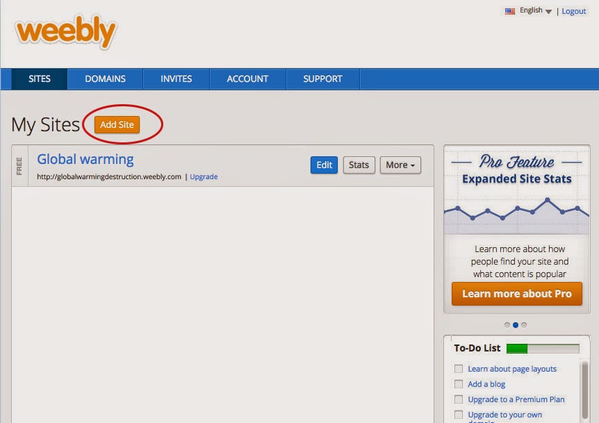
I experimented this week with a site called Weebly. It was very simple and easy to use. It takes you through the process and has the layout right there for you, including different page layouts. Plus, it's a big time saver, since you only need to really edit the  content. Let me show you how it works.

  1. First make your Free Weebly account. This allows you to publish an actual website with ".weebly.com", if you want your own domain, you must purchase it. It explains this in the site. Start off by hitting create new website.  As you can see, I already have a free website "Global Warming". This was for Earth day of 2015. This site does not have its own domain, but you can see it by going to "globalwarmingdestruction.weebly.com/". It goes over some of the causes and future we have with global warming occurring.                     
  2. Next it will ask you if you want a site, blog, or store. I chose Website. Then choose a theme. I chose to narrow down my search to websites that had a simple layout and a color scheme green and dark. The one I chose is circled in the picture.


       3. Next it will ask you if you want to have a domain or subdomain. Mine is free, meaning the weebly version. By picking something other then the top choice, you will have to purchase it.
        4.  From here it takes you to the layout where you can edit the content, pages, colors... It's very simple to use. You can edit anywhere there is text (except the footer), and when adding pages, it keeps the basic structure and you pick the layout to fit that specific page.

    5. For example, by hitting pages at the top, I can add a contact page. I will call it Contact, and then choose what I want the layout of that to look like. They have layouts ranging from About us to contact,  and even a MENU, if you had one.
I personally loved making a website, because it was fast, clean, and efficient for what type of website I was needing. It also would make a really good website if you wanted to start up a company, and needed something you could manage yourself, since time management goes quickly in this site builder. Also it's great for basic pages. And say you don't see the layout your looking for? You can delete parts, and rearrange! Simply hover over what you would like to edit, and it will pop up options for that specific element. I could delete it, enlarge it, shrink it...etc. Another thing is, it's great for having the basics. If I needed an about page, contact, and menu, the layouts are already there, and I wouldn't have to make my own css and html.  Plus I can highlight the text and change the color and size with a click of the button.


I could also just use the side bar and drag in what I want to a page! The only negative side is that maybe you want a theme that isn't provided and pages. But I wouldn't say that's to big of a downer for a simple start out site. Its faster then dreamweaver, and lets you add photos that aren't even saved for web! I recommend this site for anyone. Unless of course, your to advance. However, even then, you can add your own code and make it even better, faster! With the embed code section. And you have to tools with one click. I think it's pretty good for usability and people could have a lot of fun experimenting with this site. It's good for stores,blogs,sites,restaurants, and more. Once again, to see an example of a site I made using this, go to "globalwarmingdestruction.weebly.com/"


Tuesday, March 31, 2015

Redesigning a High School Website

For this project, I looked up school websites, and then using the same color-scheme and content, recreated the home page based on a company site. Below is the original school website, the company I am basing it on, and then my creation of the website. Then I go into the minor things I did.
Original School Website
Company website
My Website

Okay, So now I will show you different aspects of my website. I will show you the hover colors, the logo difference and responsiveness of my site. However, I did not add a translate button, as the school  did.
My Site is responsive, but the school's was not.


The hover color is red, with a background of blue, to keep the color scheme of the website.

I kept the blue color in the eyes. But I didn't know what their logo was until I saw the address of "RedHawk"

In Summary: I would like to show you a side by side of my website and theirs, and let you know I kept the color scheme, and content (except for the translate), changed logos, and also made it responsive.


To see the model of the new website's home-page (only the home page!!), click HERE

Tuesday, March 24, 2015

The need for mobile sites.

  Think about how many websites you visit a day...Theres probably more than you think. Food,maps,shopping, school work, pictures, Facebook, any social media. With millions of websites out there, why would you not? The information is at your fingertips! But, how many of those sites did you use the internet on a phone or mobile device.

Each year the percentage of mobile users compared to desktop users are increasing significantly. With 4G internet, easy access, and many needs, people are constantly researching and looking online. However, with the sites so convenient and recognizable, people go directly to the page they need and exit. There is no need to log onto a computer and sit down for something that you only need for a couple seconds to minutes. We always have our phones with us, so why not?

Don't believe it's true?

Well, taking my school site "onwravens.net" statistics, you can see the change. In 2013 to 2015, the number of desktop users dropped around 23%, and mobile usage doubled to 35%, not to mention tablet usage also increased 3%. Now this is a school site, so of course people are not checking this everyday, like they would maybe Facebook. For this site the bounce rate, which is visiting a website for one page and then exiting, was high. More than fifty percent of people visited one page on a mobile device before leaving in 2012, and this continued, and increased, in 2015. Compared to desktop with people viewing more sites and less of a bounce rate, it shows that people use there phones a lot more for quick, one page looks, before leaving to do something else. I predict by next year the numbers will keep going up, and the only need for desktop is for more "efficient and longer" task, but to just to check the weekly announcements, stick to your phone.

Is this true for other sites?

Smart in sights
First take a look at how the global usage of data compares. Now looking at this chart from Smartinsites, shows us that mobile users has surpassed desktop, and continues to grow. It was predicted in 2010, that this would happen, and they were right! Think about why this would happen? Technology has grown significantly and is constantly improving. It's like when the new iphone comes out. As soon as you get that new phone, a new one is going to come out next month that all your friends have or you see advertised. People adapt with the technology. 
Clickz
Now for specific sites, here is Amazon.com. There was more desktop usage in 2014. However, with amazon, people are using credit cards and shopping, so maybe they want to be more careful...OR maybe they haven't seen the more "convenient" way.

clickz
If you don't know, amazon has an app! During June of 2014, hardly anybody was using the app, but by November the chart sky rockets. The app is advertised, people are informed, its easy, it's quick, it's on the edge of your fingertips on click a way. And thus, the mobile percentage of users increases. This really makes you think about if your building a website. It should be responsive and work on a mobile device!


Friday, March 6, 2015

Improving the Blog

Things I Did To Improve My Blog


Adding My Logo

The first thing I did was add my own logo in the header. By adding your own logo, it  gets your "brand" or "company", or your personal icon out there to the world. It helps establish a more personalized blog. 
You can also use this as a favicon!


Favicon

I added my logo as the favicon in order to show it in the tabs. This helps people remember your logo, and as a bookmark, or app, it will appear with your icon.


Customized CSS

By customizing the CSS in your blog, like I did, you can make changes to fit your style and color scheme. It allows you to make customized changes, and add your logo in the header! I also adjusted the position of my header H1 to make more centered and not floating awkwardly in the upper corner.


Customized Gadget


A  customized gadget allows you to add gadgets that are not already available. You can title and customize these in any ways. For mine I did "About this Blog", however I could of done anything I wanted.  There are many side gadgets all ready prepared to use, but this was something I didn't have in my blog, and later I can go back and change this if I choose to.


Adding Pages

A page can be added to your blog to help organize it and make sure important post don't get lost. It's different than just posting it because it's on a separate page by itself, that can be customized to anything the user wants. I did a photography page, for an example. It didn't relate to web design, so I didn't make a blog post, but a page instead!

Adding Labels

By adding labels or "tags" to your blogs, more people can find your post easier. I labeled mine "Browse by Topics" because that is basically what your doing. This is sort of like hashtags on Instagram. People can find your post and blog by these key words. Add words that relate to each blog and blogger compiles them for you to add in a gadget. Then users can go on your blog and click the topic or subject they want to see blog post about.


Customizing the layout


 You can customize your blogger with different color schemes, backgrounds, logos, images, headers, and more! I personally used one of the templates and customized from their using their other background options. However, you can choose to upload your own images for a background. Also if you go to advanced settings,  you can edit the color choices and images. I chose to do a pink color scheme to match my background. I chose header options, link options and text editor to make them pink and the title Turquoise.


Adding Social Media buttons

With a social media gadget, people can pin you, find your youtube, twitter,facebook, and other social media gadgets. This spreads your name!!

What is displayed?

I customized by blog post to only show one post on the main page because if not you would be scrolling and scrolling. You can customize this to make however many post you would like to show and choose how they are displayed and what text will be shown to get readers to see your other post.

Monday, January 12, 2015

My top 5 Leadership Strengths

How did I discover my top leadership skills?

Last Friday at my school, I participated in an activity that clarified my results of a leadership test created by GALLUP.  After completing the timed test, it gave me the top five out of thirty-four of my strengths, which was; individualization,strategic,connectedness,restorative, and developer, along with a brief summary of each of these themes. Reading through I found that I relate to most all of it. These strengths are important to understand in order to build your leadership within a group.


MY TOP 5 Qualities        

  1. Individualization- This trait was the one I connected most to, which falls under the category of Relationship building.  I can see this in my daily life, in which I can pick out each person's unique qualities and what each of their strengths are. It also explained why this trait applies to why I pick out each person's birthday present very particularly to that person. I tend to do things like this a lot, which contributes to my personality I think.  The leader in charge really gave me insight on this, because in basic terms it is being the "observer". I definitely observe more than I do participate, because after watching, I learn,and act upon that knowledge.
  2. strategic (strategic thinking)- "Mindful of seeing patterns that others see as complexity , allows [me] to play alternative scenarios [in your head]." This quotes was in the summary of my traits.  This is the most common thing I tend to do in my head, while thinking. I always think of the "what if", and analyze the results, which benefits me by allowing me to keep the end in mind, eliminating choices that other wise would be "dead ends". 
  3. connectedness- "Things happen for a reason. [I am] sure of it." and "If we are all part of a larger picture, then we must not harm others because we will be harming ourselves". This is also a relationship building category. I connect through people and experience, with personal traits that are "considerate, caring, and accepting". I believe that each person has their own journey and if we cross along the way, some need a push to continue, while others can enjoy the ride.
  4. restorative (Executing)-What I took out of this trait is being positive even if you have to pull that out of the negative situations. I tend sympathize and relate freely, and in a way build from that. I reconstruct my thoughts based on how I bring the "dead traits/feelings" back to life. I take everything as an opportunity to improve.
  5. developer( Relationship Building)- This was my 5th ranking trait. I feel like this trait fits into my other traits such as individualization, because having the ability to observe and pick out the importance of each person doesn't stop there. Most of the time, I look for ways to challenge people, and build them up, by taking their strengths and finding that balance. Sometimes I do it without me even realizing it, and other times by them not realizing it.


What does this mean?                                                                         

Most of my traits fell under the category of Relationship Building. (individualization connectedness, developer). Relationship building is what it appears to be: Being more connected to each person....It was shown in a team activity we did. 

Each team under the different categories (Executing, Influencing, Relationship Building, Strategic Thinking) were to create a business. 
My team RB, did a game system cafe. People can come to "Arcade Cafe" and play different consoles by the hour, while their is a little cafe incase your hungry or thirsty. So imagine a panera bread or starbucks added to a modern day arcade (xbox,playstation,computers, wii's,nes, and so on). It was pointed out that this business is something that we picked out of relationships! I am a high schooler junior, and most people I interact with like coffee and games, so what did we do? Create a place for both because people relate and connect to that!  While other teams did things strategically or executing.... They picked businesses that were in their strengths. Like a law firm or cookie dough business. 

We can use our strengths to cooperate with each other. With different traits we'll all have our own part that can benifit all of us. For instance, by knowing that one person is good at relationship building and the other is a great executer at things, they can use their top strength to get the job done. An example the leader said was "Maybe one person is good at talking to others, while the other executes the project on display,. such as one person goes and makes conversations and gets "koodos" with the clients and the other works with the technology...."

The most valuable thing we can take out of this is that everyone will have different strengths and we have to be able to not focus on our weaknesses, but rather appoint people different positions that adapt to them.