Portfolio

Monday, November 24, 2014

Texture in Web Design


The following  answers summarize a tutorial on Smashing Magazine’s web site, called The Whys And The Hows Of Textures In Web Design, by Jon Savage and Simon Hartman. 


  • Texture is seen a lot being misused, making a website look not as attractive... Instead the website looks "dirty" or "grungy". In reality the texture was just over used and misused! 
  •  Textures are bigger and don't repeat, whereas patterns are repetitive small images, and can be tillable...
  • Texture can direct the attention of users to certain elements, directing them as a "call to action". It also can separate your context from the rest of the website, highlighting certain things like the title, backgrounds of menu's...
  • It can guide the  eye and create divisions in your work. While also creating a good contrast and layout that allows users to process the information, completing the website's style.
  • Texture can give a website the "wow" factor, making it memorable and more appealing. It gives your website more of a style and brand,  by adding an emphasis.

Tips
  1. Maintain Legibility: Make sure your texture is not to dramatic, in which your text in unreadable, or had to make out.

  2. Dont Beat a Dead Horse: Don't use texture in bulk because it will be distracting and less appealing.

  3. Practice Means Improvement: Play around with different textures to see what you like best.

  4. If It Serves No Purpose, Take it Out: Make sure your texture is there for a reason, that is benefiting your website, not there because "I couldn't decide", or " i through it in there".. Have a reason to different texture elements.

  5. Consider the Effect You Are Trying to Achieve: Picture the end in mine, with the mood your trying to create. Keep the texture to just create the effect, not over-due and kill the mood.
  6. Collect Resources so you Dont Have to Search Later: Create a folder with all of your resources like free brushes and styles so you will always have them for backup and future use.

  7. Learn Masks: When designing, keep in mind that hiding different layers is benifitial  and time saving.

  8. Dont Sacrifice Quality for Loading Time:  Do not use a poor texture in order for quicker loading time.  Try repeating small tiles of textured patterns.

  9. Choose Textures Logically : Pick your texture based on your website's point and goal, make it relevant that they match.  (you wouldn't put random bubbles background on youtube...)


What are 3 different ways you can come up with your own original texture images? 


  1. Take pictures yourself to upload. (bark, wood, dirt...texture is everywhere..)
  2. Use a scanner to scan materials you have..(Paper bags, mouse pads, wrinkled paper.)
  3. Use tools on the internet! Photoshop has filter effects even in the program. Take a simple layer and merge with multiple. You can take a solid color and add a filter effected to create texture.

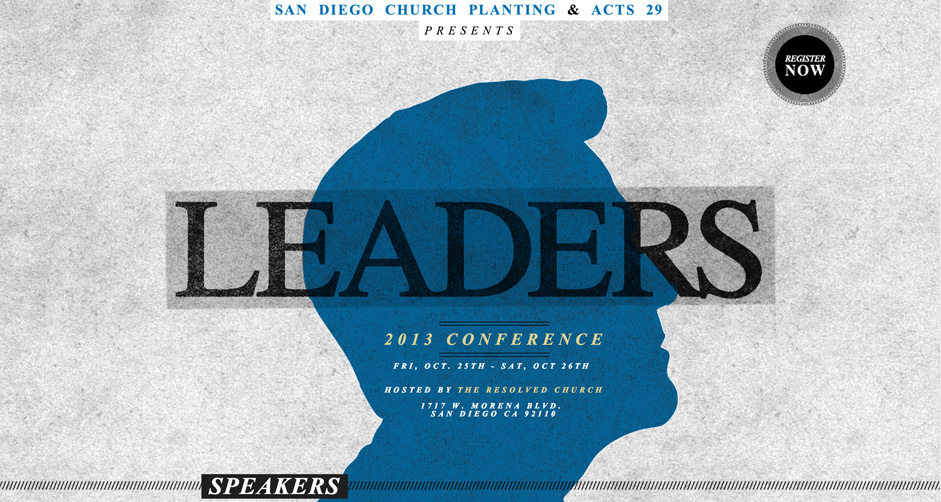
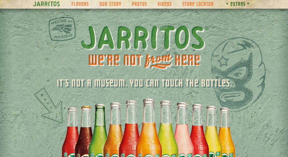
GOOD EXAMPLES!
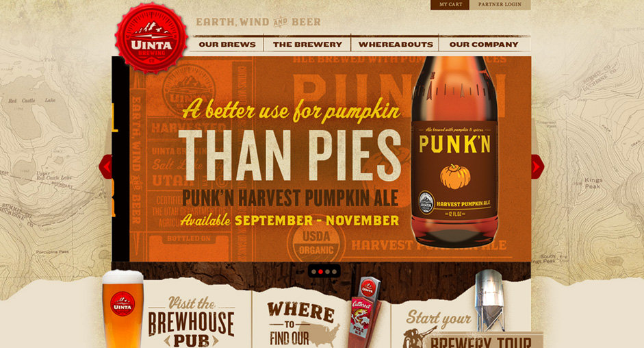
Uinta Brewing

Uinta Brewing

Leaders

Leaders

Jarritos

Jarritos


Thursday, November 6, 2014

Jabberwocky

Jabberwocky project

For this project we had to take the html and css of a page and redesign it only by changing the css. This is an assignment based on Css zen Gardens, where all of the pages you see on that website have the same content (html) and have been designed with CSS styles. 

The original site looked like this below
This is the page we had to redesign with CSS

The page began as a basic layout. The divs containing the header,body,  links, explanations.... and so on. Also it contains all of the text needed. Now we just had to rearrange and decorate. The first process was having a simple sketch to have an idea to grasp and reference.

Want to see the site yourself?
Pictures below or come to the site!


This is my sketch of what I wanted to create


This is what my design looked like finished


Tuesday, October 21, 2014

Review on Toms.com

TOMS... 

How is the USABILITY?


The TOMS website has a very clear, easy to use Menu/Navigation. It stands out and is obvious on what you can do, and if not there is a search bar above. 

The links are distinct, working, bold, and relevant in size. It is easy to read, fast and responsive. There is sufficient spacing in-between the body text, while the links are highlighted, or different color. 

The site as a whole is very efficient and not frustrating at all. The usefulness of it all is very clear as you go there to buy shoes and learn more about how you can help. TOMs offers more than just shoes. In order to get the "enjoyment" out of a website, the content and look of it all has to be relevant, but also the purpose to why you are there makes a difference; if you go look at this site on accident and browse, there are no games, things for sell like craigslist, but they sell shoes with a story, and by knowing this it makes the website more useful. 

Overall, its a great website. Great color scheme, organized, useful, easy to learn, but there is one pop up question before you enter the site, and that can be bothersome for others if they don't want to enter their email or don't know how to get to the website without entering it. (just click away from it/ is there an x. sometimes you just go to play around)

Wednesday, October 1, 2014

Website Usability bad and good


WEB DESIGNING 101 


This website is unclear on what is defined, and is far too busy. It has excessive busy-ness as everything draws my attention.


The competing noise is slim, but there is a no contrast from the background to the menu above, where as the body is clearly defined.


This website confused me because the random, moving, floating meat in the background is not even clickable, not to mention a receptive song about their meat plays on repeat!


The links are clearly visible and if you hover over them, they change to a yellow as shown on one of the icons.


WoW! This site is like looking at an add in the paper for things to sell, but far less organized. Some things are boxed others are randomly there, like the dancing Santa at the left/ bottom of the screen. It shows poorly the rule of clearly defining a space!

Tuesday, September 30, 2014

Bad Examples of Usability of Websites

Ugly Tubs

 This is a very distracting website. The search engine is unclear, the graphics are a bit scary frankly, although they grab my attention, The links are all cluttered, and I am unaware of the most important things on the page.


Jamilin Skin

This site is better than the first example, except it's hard to know what I am looking for. I did not know what I'm suppose to look for or why I was here. I didn't even know the name of the website.


Friday, September 26, 2014

Ferguson-Filling in the gaps

Current Events
When media outlasts fill in the gaps between the stories that don't have all of the information they tend to be biased based on what they believe or what others would be likely agreeable to. They take their opinions to piece together the possibilities and the more people that support, the more it becomes a false reality.

As humans, we see patterns; we try to make connections; this alters are perspective... We look up, read, act, all according to our interest as social media records this and influences us to continue. Social media predicts to what we tend to support.

Posting this info on what you believe or heard, from an already biased opinion, adds on and continues the spreading of the unreliable story. Soon everyone has their own clusters of opinions because they all were attracted to the same source feeding. It's like a rumor that is believable due to the fact we agree it "could" of happened.

 In politics this occurs as well. Why? People are subscribed to their sources they like and want.  The views are not being challenged; they are encouraged! If a person is voting for a different president than their neighbor, the reasoning behind it is deep in the roots. Both have absorbed some sort of information and grew on that and until it becomes more reasonable they will not look at the other point of view. Right or Wrong. What they believe- will always have back up and those against it. It's choosing a side. This means CONVINCING is part of the key...but that just continues the cycle though. Right?-You convince someone because you want them to be on your side. So who's side are we on?

Thursday, September 18, 2014

CMS Sites

CMS

The CMS is computer software that allows you to edit, publish, store, organize and modify your content. It is highly seen in blogs and marketing. Word press is one of these CMS’s..

Here are a few examples of a word press site:
Coca-Cola Website

Rolling Stones Website

SONY website

Friday, August 29, 2014

Google Drones

    Google has recently tested delivery by drones. The first real test included a variety of products ranging from candy to medicine. Other companies, such as amazon, have been contemplating these type of deliveries. Google has a big picture in mind that they want to use the drones for. The researches and developers would like to use this to deliver medicine, supplies, and urgent care materials. They are slowly building there way toward advancements and more successful deliveries, in hopes to better the environment.
   I think that this could cause conflicts, but on the other hand be beneficial. On one side, this is costing a lot of money...We already have delivery systems that are fairly quick. The other side is that it is a good possibility for fast delivery on medicine and the needed items in emergencies. If we limit our sources and ability with the drones we may find it improving society. This could help military and other countries as well.....Amazon and other companies need to clearly think of how this might effect them...And HAVE GOOD REASONS. I personally don't need my $6.99 book from amazon delivered by a drone. (not that this is what it will be used for) but per-say if in the future these are the "next big thing"...Is it good for the economy, environment, and the people?
I wonder how they will keep improving technology and what the future holds....

Want to read more about the Drones? CNN Drone news-click here

Monday, August 18, 2014

Waybackmachine-3 websites' before and after

BEFORE AND AFTER


The old Deviant-art Website


The previous Deviant-art website had little to know contrast, with very dark green as their main color. The only different colors used were a lighter shade for highlighting titles, and the change of green for the link icon. The usability is still good to use, very current to now, with searches.


The current 2014 Deviant-art Website

The new Deviant art website contains a much contrast that is appealing to look at. The graphics are displayed first hand, and the pops of color stand out apart from the background, images, and titles. The usability is easier to use because it is less cluttered with wording and organzied well. The layout is also better without list, instead the graphics are the main attraction.

Previous Coding for Deviant Art
The coding in comparison has more color css, along with divs, although both still contain tables. The coding goes further in depth, even simplified, and changes the colors of borders, text, highlights, and divs. The new site also adds the graphics in new in the coding. You have different font-weight, and alignment.
Current 2014 coding for Deviant Art

The design layout is much different with the color scheme and layout principles. Both still contain graphics, however you can see the logo changes with the wiki checkmark to a nice clean cut layout tiny by the search, with the graphics now the main attention spot. The  green in the new layout makes a great contrast, along with the bigger graphic images and less words.  The tabs are now icons and do not look like "actual tabs" like before...


The old Wiki how coding


the new coding for wiki how


 The differences I mainly notice in the coding is the use of tables vs. divs. The divs have their own class and image, with titles as the other coding has tables with things separated into rows. There is also id's and style sheets now, opposed to the tables with more padding and longer codes. The new html is simpler, looks more organized and controlled. They also plugged in background images with html, not a plain color without texture that set each individual with their own unique coding...
The previous ebay
the current eBay